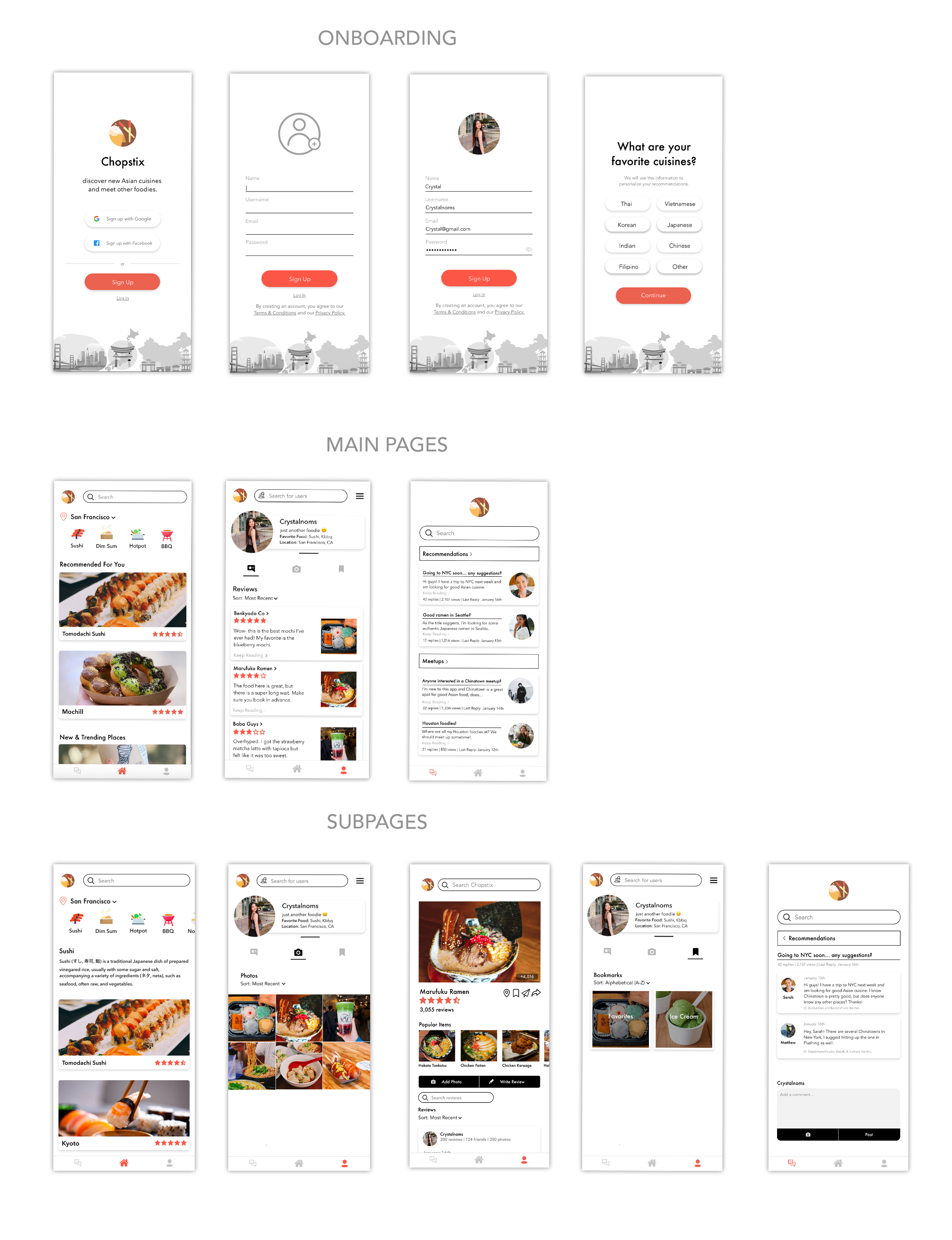
Chopstix is a mobile application designed to connect foodies who are interested in Asian cuisine and allow them to discover new restaurants wherever they go.
The issue that is explored is that Asian cuisine can be difficult to find, and there are not many forums specifically for this ordeal. This was confirmed after conducting interviews, where most agreed with this statement.
These issues led me to create an app concept catered towards Asian cuisine in addition to social networking between foodies and newbies. I, myself, am a foodie with a food Instagram so I am able to utilize my personal experience and gripes as well as my fellow foodies' opinions.
Role
UX Designer
Duration
~2 weeks, Sept. 2020 ~1 week, Mar. 2021
Tools
Procreate, Adobe XD, Photoshop
The Problem \
There are a lot of mobile applications that are revolved around food, and the topic of food has become increasingly popular in recent years, especially due to Korean mukbangs. However, there is no application dedicated to being a social forum and review app simultaneously. There are also no applications dedicated to strictly finding Asian cuisine.
The Solution \
Chopstix is a mobile application that integrates restaurant recommendations, a community forum, and reviews catered towards Asian cuisine. It addresses the issue of lack of authenticity/reliability all the while introducing users to a discussion-based social platform revolved around the topic of food in a way that is unique from other apps.
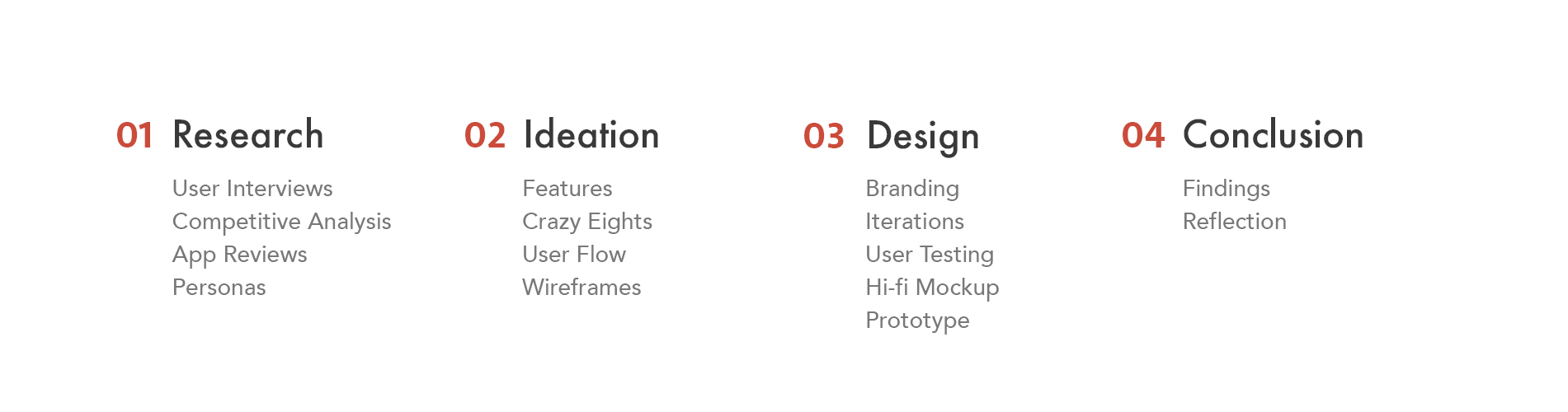
The Process \
01. Research \
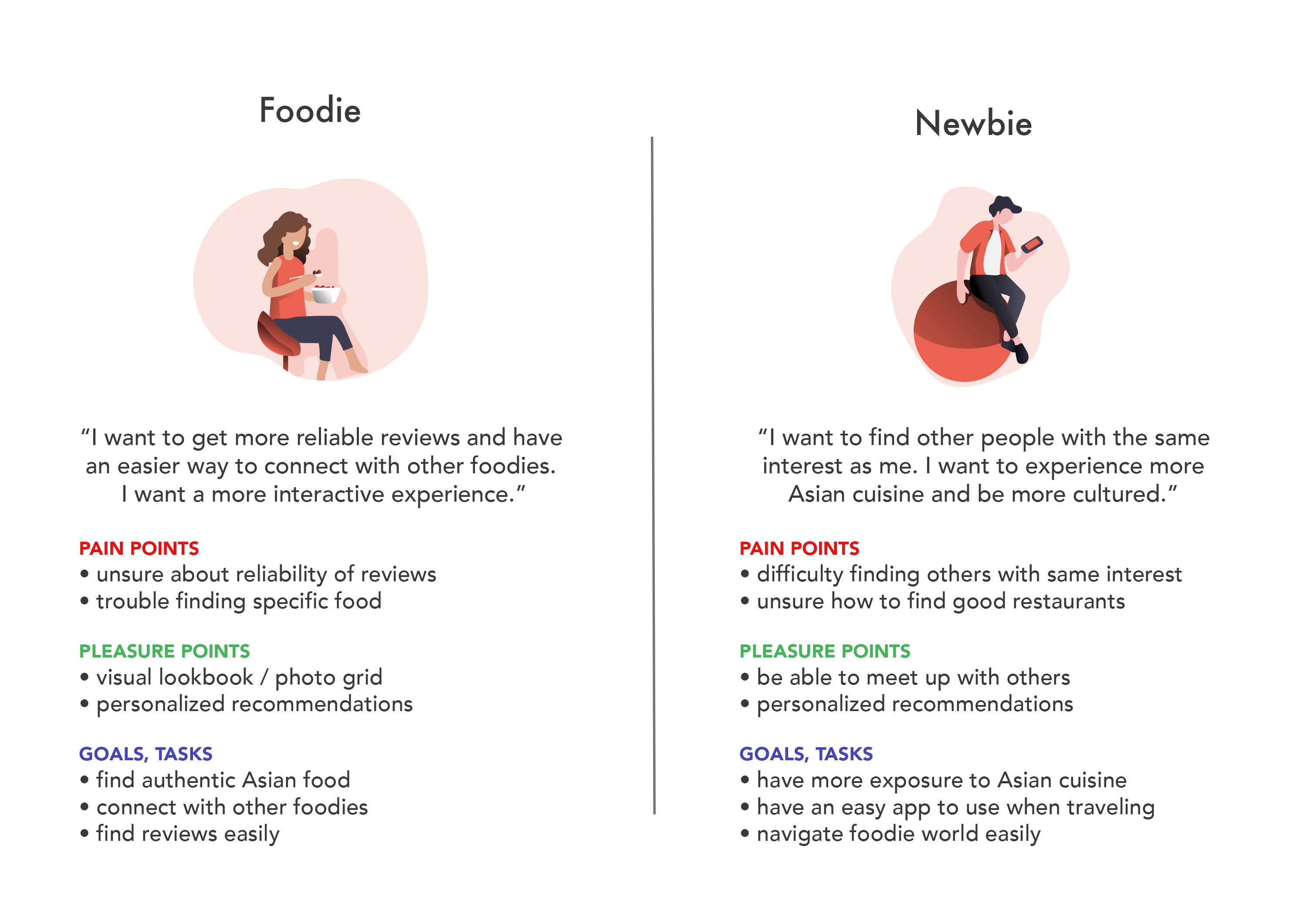
I defined a foodie as someone who is an avid user of food review apps, such as using them at least 2-3 times a week, or who has a strong social media presence in the food realm. A newbie, on the other hand, would be someone who is either inexperienced in using such apps or more new to Asian cuisine.
Utilizing my network, I conducted 5 interviews total; I interviewed 3 foodies and asked them various questions, such as what food apps they use, their ideal features in a foodie app, how they discover foods and foodies, and if they have difficulty finding Asian cuisine. I also interviewed 2 others who are newbies so I could accomodate to those interested in trying new foods.
I found that 80% agreed it could be difficult to find Asian cuisine, confirming my proposal.
I also analyzed app reviews (those that I chose for competitive analysis), sorting by both critical and most useful to obtain an open perspective of what users were both happy and unhappy about. Utilizing the most common complaints, I targeted these issues.
Key Findings
5 Interviews Total
High Priority
• Easy to find recommendations
• Ability to connect with foodies
• Place to share photos
Medium Priority
• Nearby recommendations
• Bookmarks/collections
Low Priority
• Map to show food in nearby radius
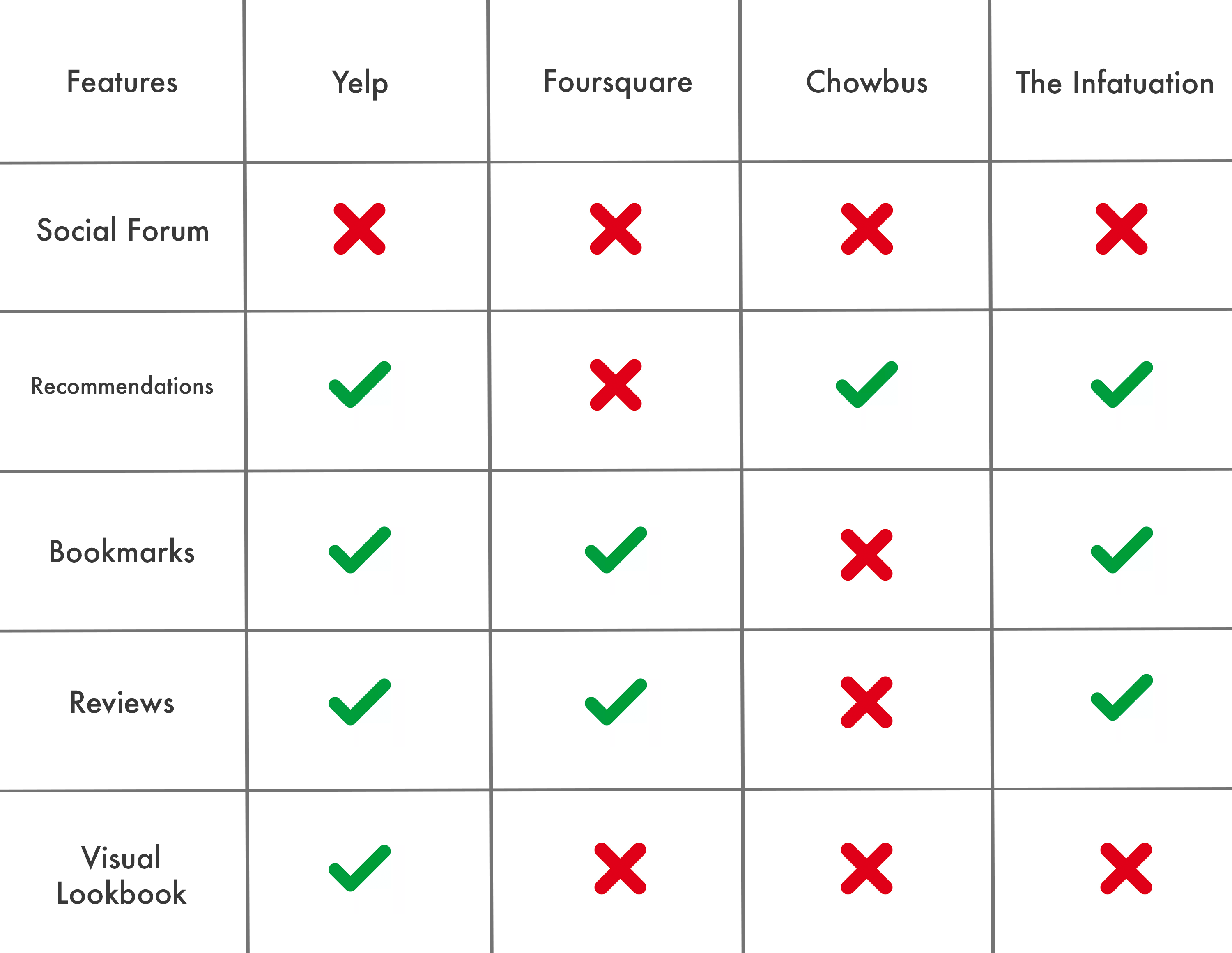
Competitive Analysis \
I chose top food review apps in the App Store, which were Yelp, Foursquare, and the Infatuation. I also chose ChowBus due to its focus on Asian cuisine. The key features that I compared were recommendations, bookmarks, homepage, and forum. Pictured below is a visual representation of what features each competitor lacked or possessed. As a whole, all of them lacked a social forum and most were lacking a visual lookbook for photos. Not one of the apps contained all of the key features, so I decided to take the opportunity to create an app that would combine all of the desired features and meet user needs.
Personas \
Based on my research, I created two personas consisting of primary users and secondary users. I wanted the app to be inclusive, helping both those who were experienced foodies and those who wanted to learn more about Asian cuisine and using food apps in general.
How might we create an improved interactive experience for like-minded foodies combined into a single platform?
02. Ideation \
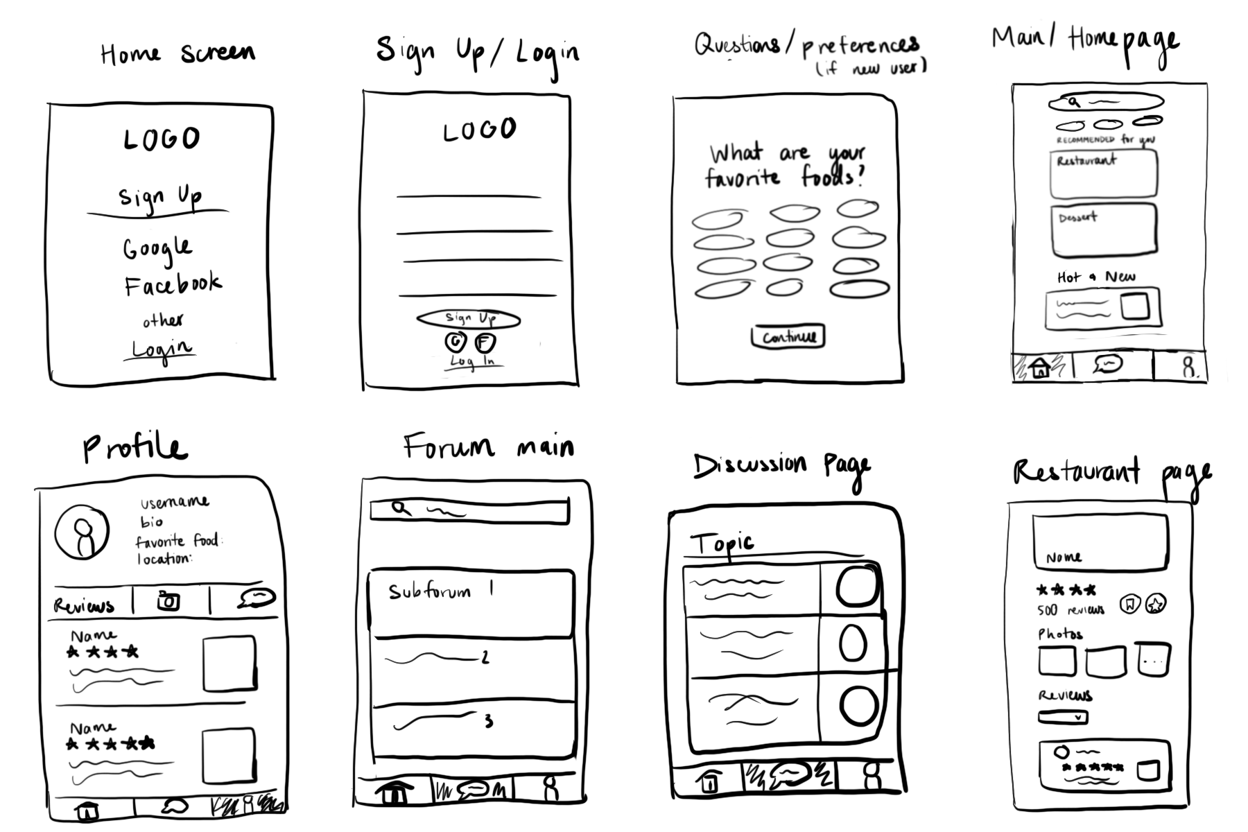
As the first step of ideation, I decided to do a speed run of Crazy Eights. Chopstix is intended to create a personalized experience for each user (foodies and newbies) and provide them with features that they would both be able to utilize and enjoy. With this in mind, I quickly sketched out the personalized onboarding and key features that I had used during my competitive analysis.
Crazy Eights \
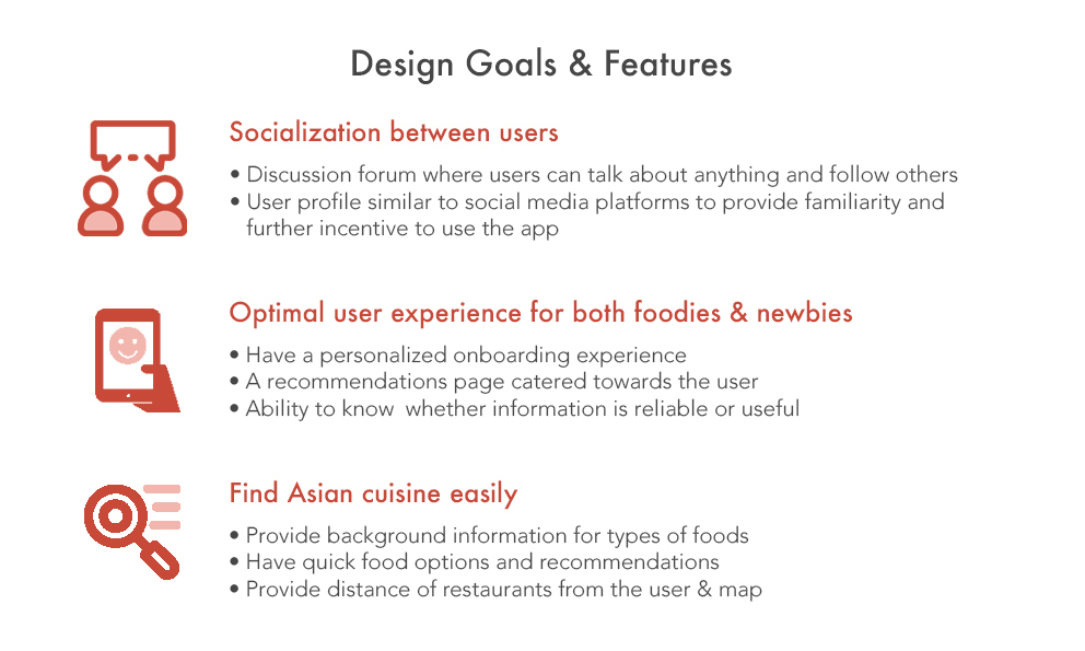
During the second round, I chose to focus on the following 3 screens during the exercise:
• A user profile that is similar to social media platforms, providing familiarity
• A recommendations page that is personalized and catered towards the user, making it friendly to new users
• A restaurant landing page that provides many options and information, making it convenient and insightful
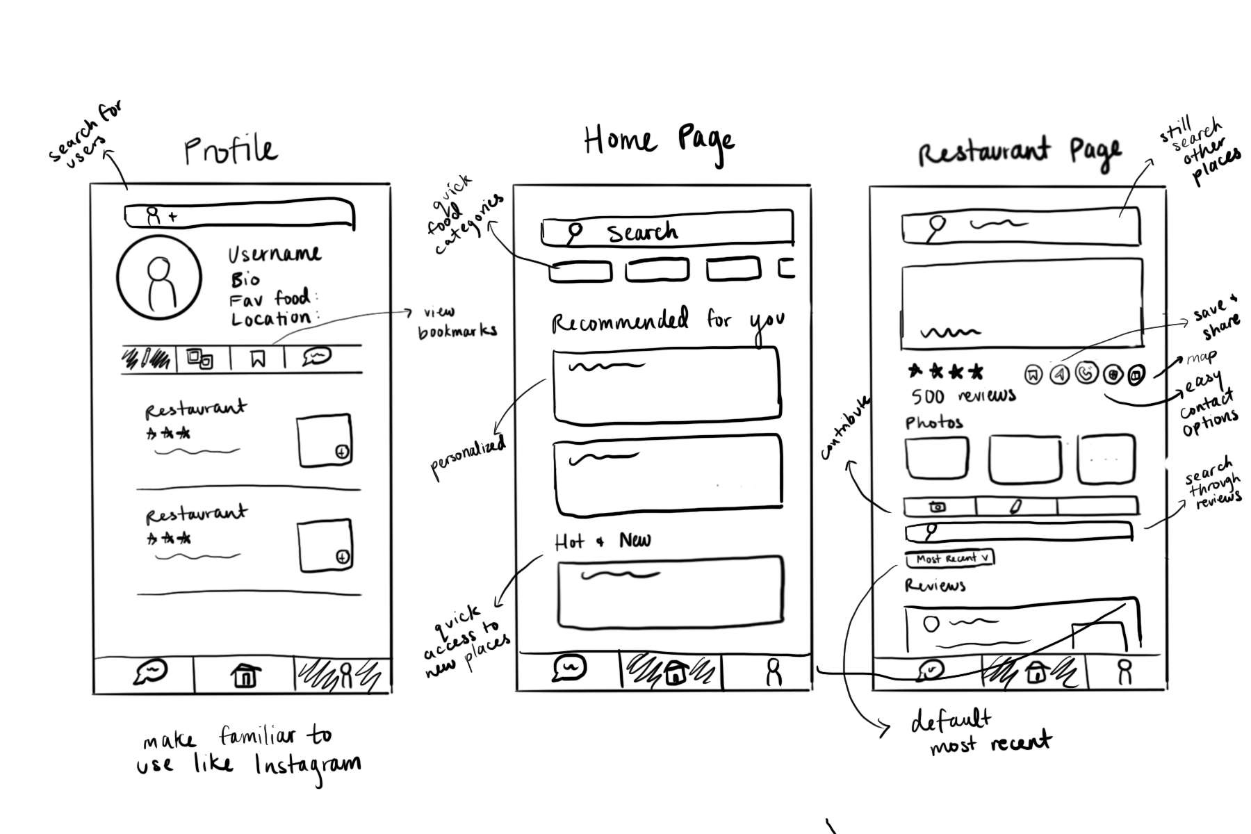
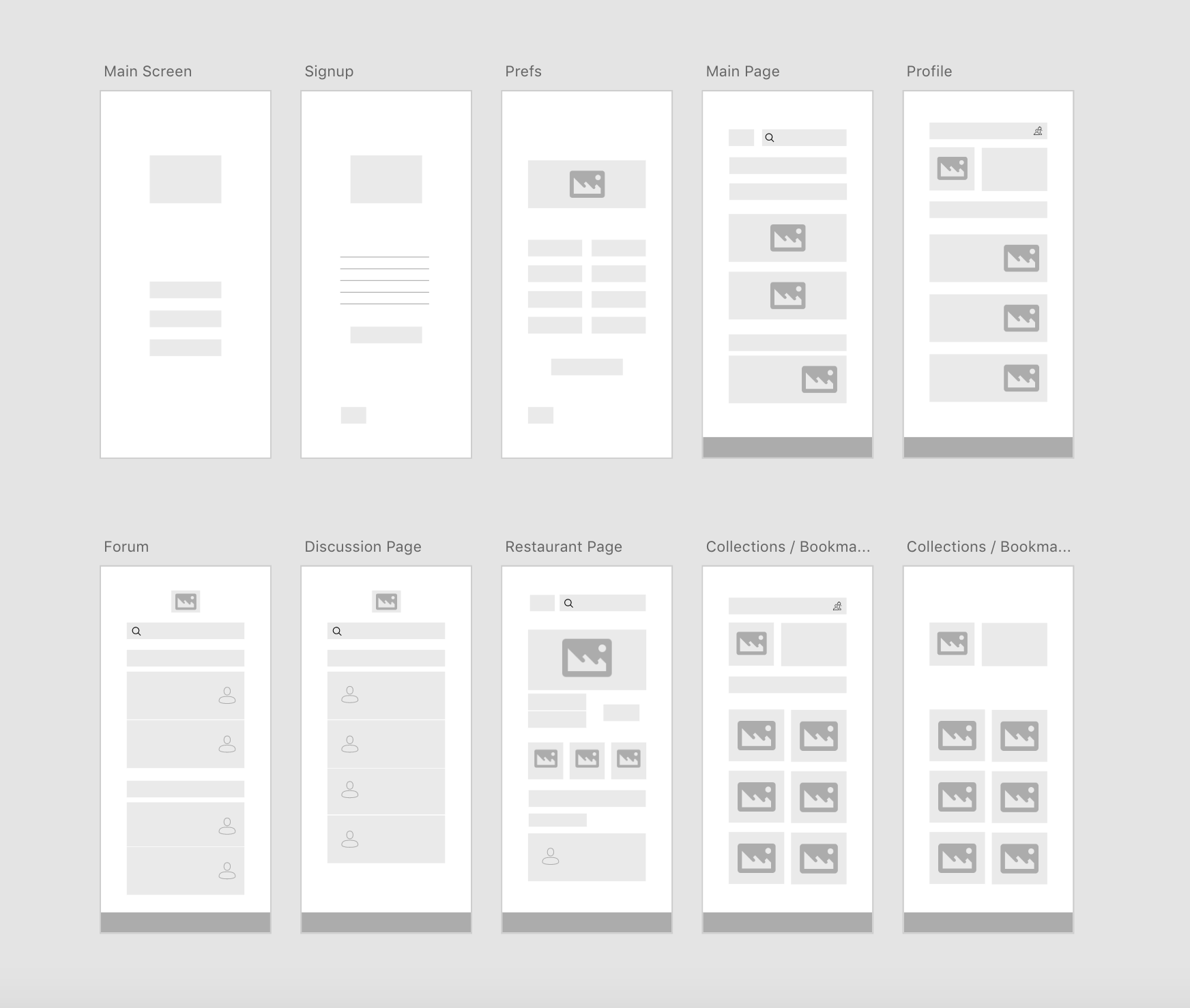
Wireframing \
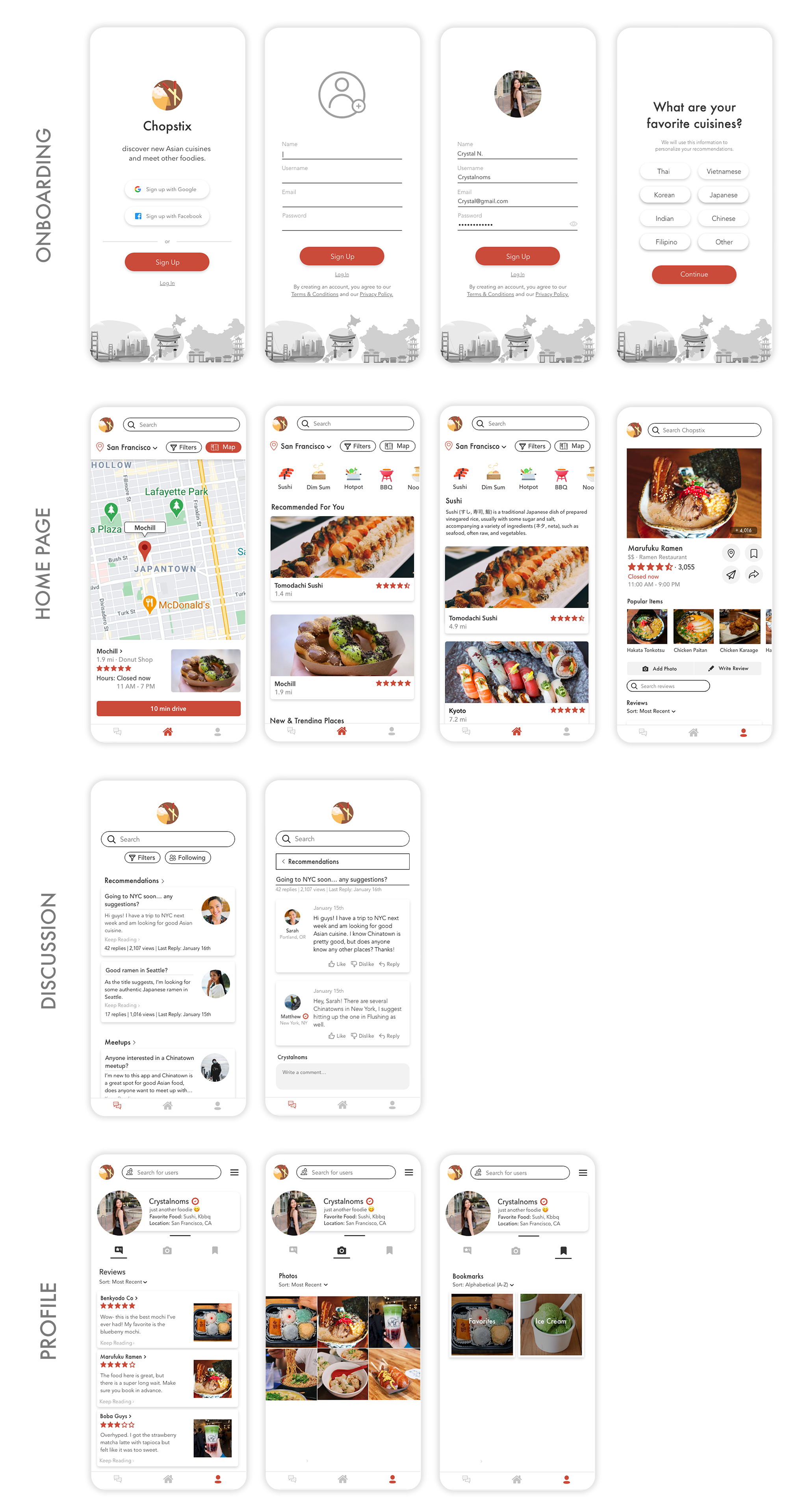
I then took the ideas I formed and used Adobe XD to create wireframes. I added in preferences on the onboarding to personalize and account for the user's interests. I added in a discussion forum to focus on the idea of socializing and connecting with others.
03. Design \
Branding & Colors
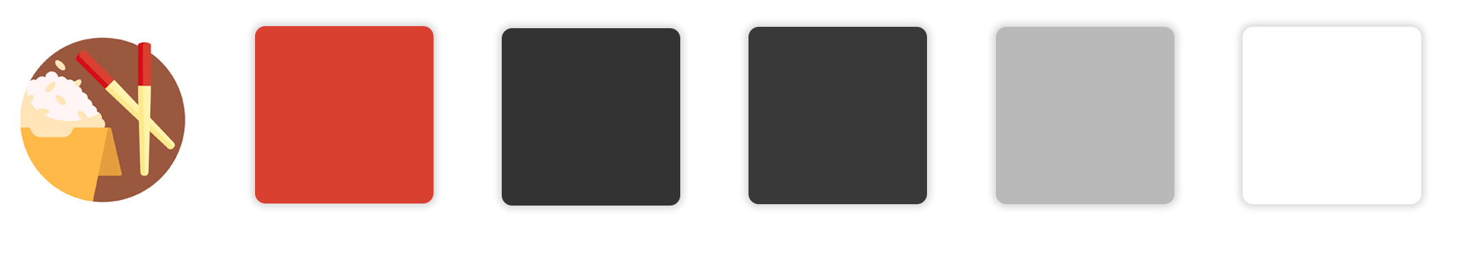
In Asian culture, red and yellow are two colors that represent luck and are good symbols. I wanted to implement this cultural bit into my design. Originally, I had a lighter shade of red as well as black, but I changed it to this palette. Below, in my accessibility section, I explain why.
High Fidelity Mockup - First Iteration
This was my first iteration before I did any user testing. It had my old color palette and lacked the features that the current, final prototype has. The goal of this first design was to tackle the main priority points I outlined earlier based on my key findings. It focused on the social forum, personalization, and food types.
Please note that the picture is smaller as it is not the final design.
User Testing Process \
Revisiting my project in March, I gathered a participant group of 5 users, which included both foodies and newbies, and created a set of tasks for them to complete while user testing. After testing, I had them answer a Google forms link with questions to gather feedback, keeping in mind the overall goals of the app and how the features could be improved.
• Introduced the project background and goals
• Provided a set of tasks that guided the user
• Asked questions related to underlying goals and design to gather feedback
Feedback Summary
• All testers liked the overall design and features of the app
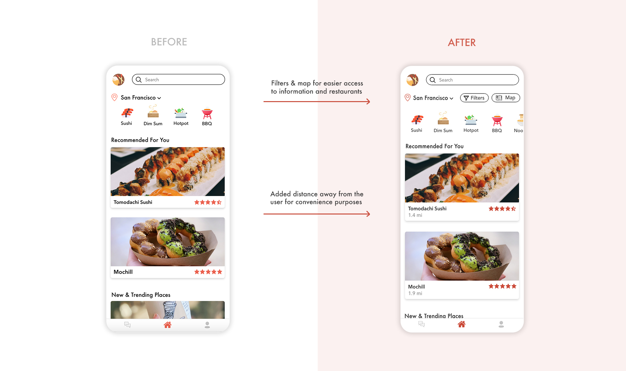
• All testers recommended a map/distance be added
• Most wanted filters to be added
• Most testers agreed that this concept was unique and has potential to compete with top food apps
Colors & Accessibility \
As mentioned in a previous section, I changed the color palette slightly after my second iteration. I took WCAG guidelines into account to ensure accessibility. I changed the color of the buttons in order to improve the color contrast and meet the AA standards. In addition, I replaced pure black with a lighter variant, as black and white are the highest contrast and tend to be straining on the eyes.
I also increased the font sizes so the items would be easier to read and spaced out buttons in order to follow touch target guidelines.
Iteration 2 + Changes \
Overall, the following features were added or changed:
Features based on feedback:
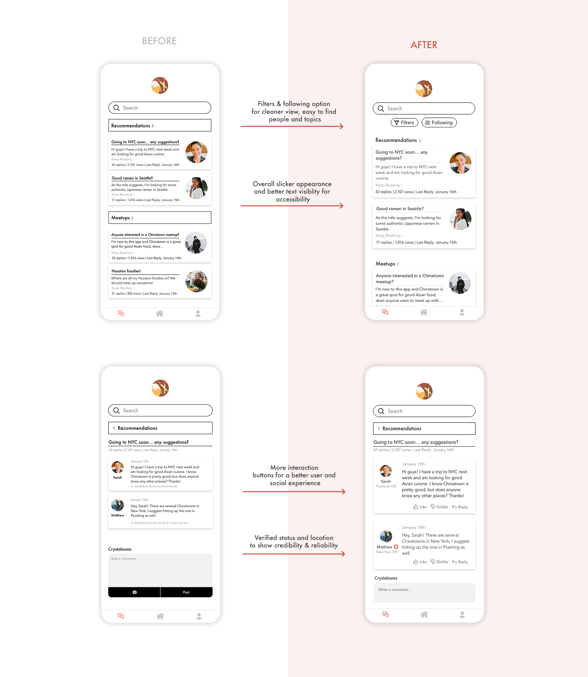
• Filters on the home and discussion page
• Map to see where places are relative to the user
• Option to see friends/following list's posts
Features based on my research/perspective:
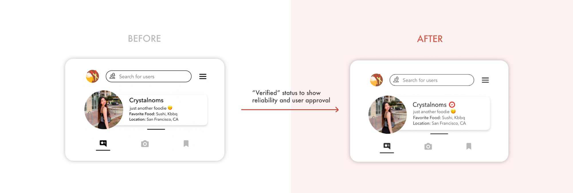
• "Verified" and rated accounts to help with reliability factor
• Interactive buttons on discussion posts
• Restaurant times and pricing on their respective page
• Improved overall accessibility
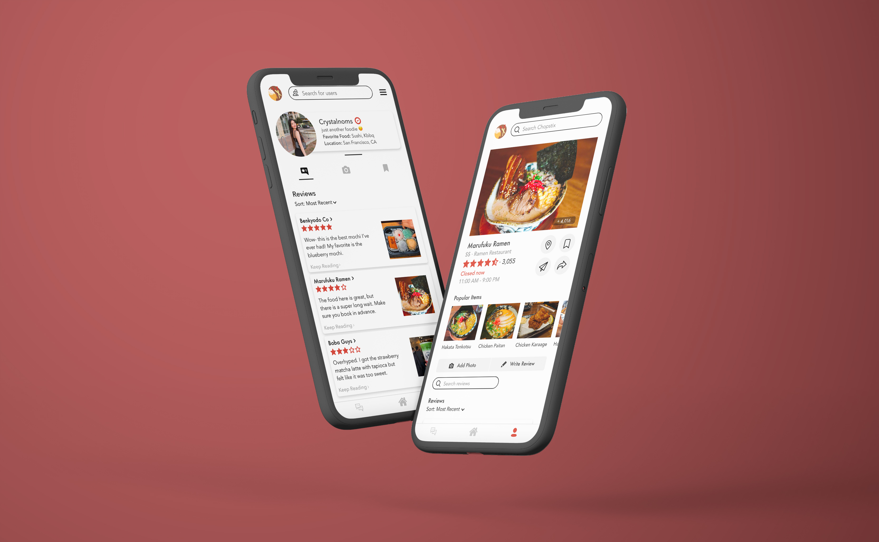
Home Page \
The home/recommendations page should provide information to the user easily and conveniently. Based on feedback, it was requested that distance, filters, and a map be added so it would be easier to find things. For the map feature, see the feature breakdown section below.
Profile \
As a goal of providing Asian cuisine reviews and a concern of reliability from the "Foodie" persona, I added a "verified" status next to the user's name on their profile so when others view it, they will know that they are looking at someone who is reliable.
In addition, I made slight changes to the description so it would be more visually accessible, such as making the font size larger and providing more line-height spacing.
Forum \
I made changes to the overall appearance of the discussion forum as I felt it looked a bit cluttered. My changes were also based on accessibility and easier to read text, all while creating a neater appearance.
Based on user feedback, they wanted a way to view their "following" or friends list and see what they were up to. As a result, I added filters and a following button.
Generally, a discussion thread has the ability to like, dislike, or reply to comments, so I added these options for a more interactive flow. I also added more information about the users.
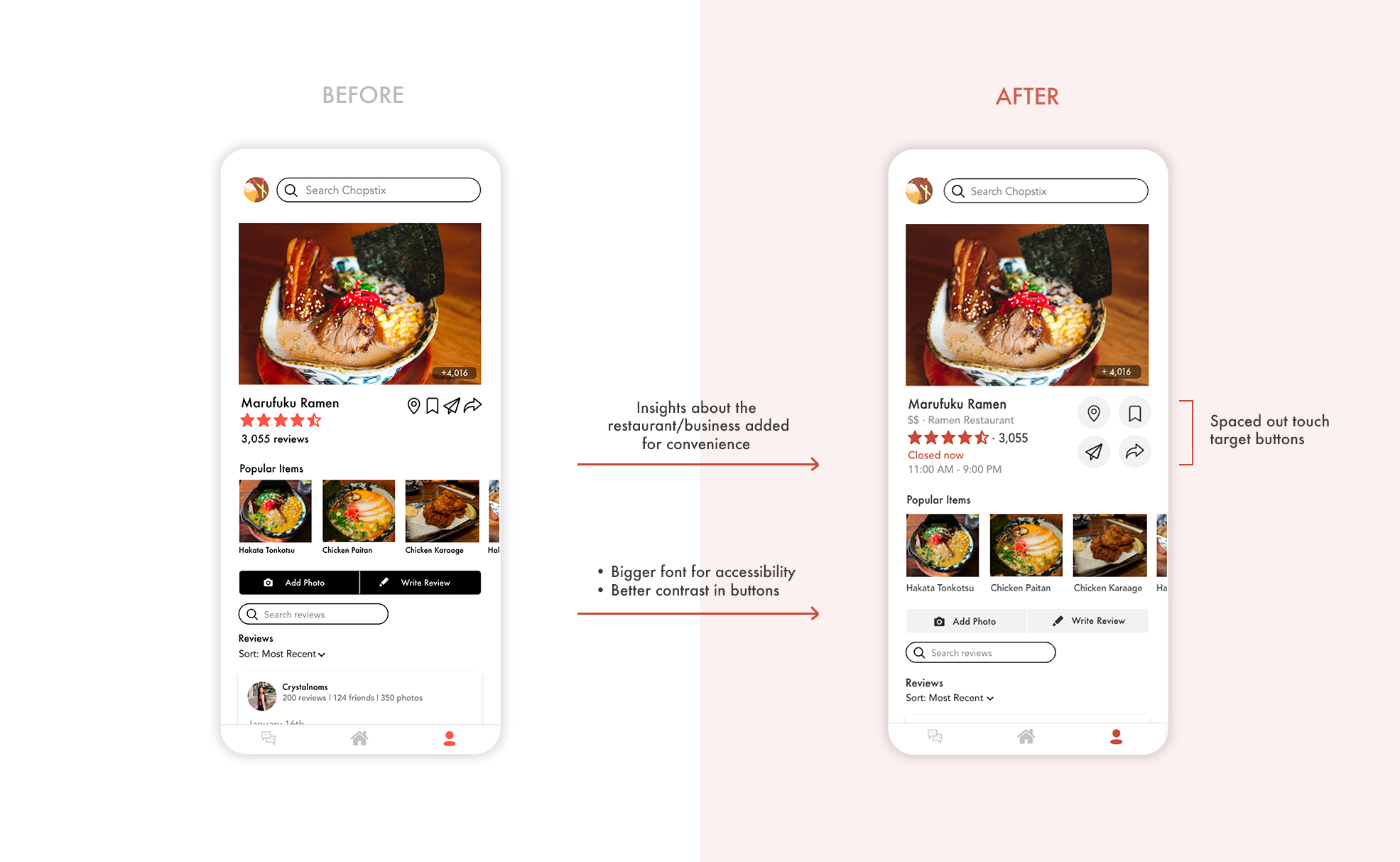
Restaurant Page \
Based on user feedback and for a better user experience, I added more insights about the business, such as opening hours and pricing.
In terms of accessibility, I improved the touch target buttons and increased spacing between them, I increased the font size for the "popular items" view, and I changed the color of the action buttons to have a less harsh contrast.
Feature Breakdowns & Reasoning \
I decided to choose and add the features that I did to target the initial goals I had, which was prioritizing personalization, socialization, and reliability in [Asian cuisine] reviews, while keeping in mind accessibility guidelines. Below I have laid down the goals, wants, and subsequential solutions.
Final Screens \
Interactive Prototype \
04. Reflection \
This was the first personal UX project I'd ever completed and I learned a lot from the process. I found it interesting from my interviews and research to see what users value in food apps and apps in general.
In the end, I was able to hit all the points from my key findings based on my initial interviews.
I revisited this design in March 2021, as previously, I felt that I could have done more of the UX process, so that is what I did. I gathered some user feedback through user testing and really enjoyed doing so; doing user testing allowed me to see things from a different perspective and implement new features I hadn't thought of. In addition, I learned more about accessibility and how it plays a role in design.
As for what I would improve about it, I would create a dark mode and add more flows.
Lastly, as a personal aside, it was fun how I was able to incorporate my own food photography pictures into the design.