MyFitnessPal is a widely used app that allows users to keep track of their fitness journey, mainly used to track one's calories.
I have used MyFitnessPal for over 5 years, and can remember feeling that the user interface and overall experience could be improved and more modernized. I have also noticed others complaining about the design as well, so I decided to do a redesign of the app to allow it to have a more simple and modernized appearance as well as an easier user experience.
Role
UX Designer
Duration
2 days, Jan. 2021
Tools
Procreate, Adobe XD, Photoshop
01. Ideation \
I started by reviewing each screen of the app and critiquing them based on how they could be improved.
02. Design \
Style Guide \
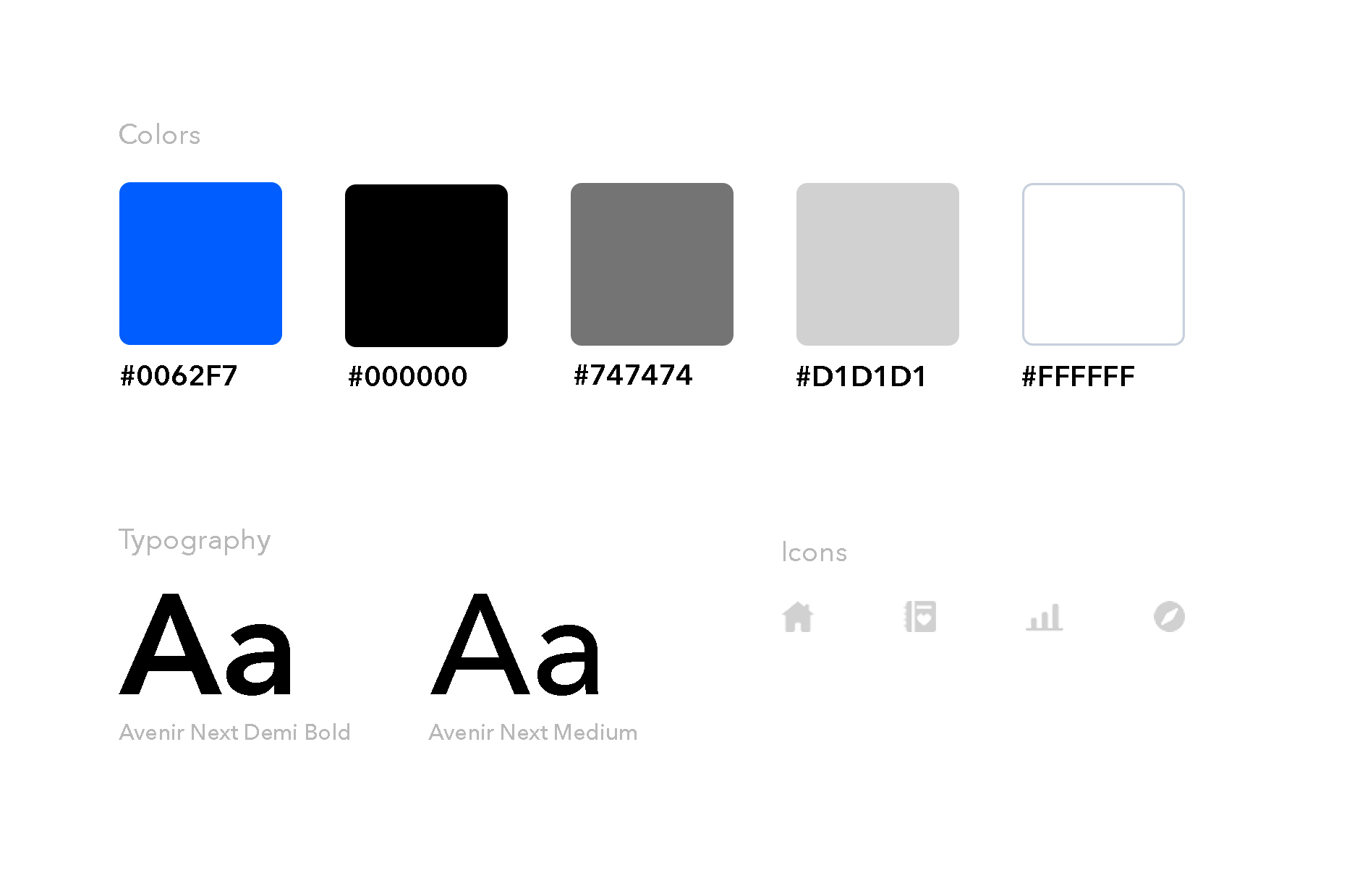
MyFitnessPal's main color scheme is blue, white, and grey. I decided to use these colors and maintain a minimalistic style. I chose icons that were flat so it would be easier on the eyes and visually appealing.
A/B Screens & Reasoning \
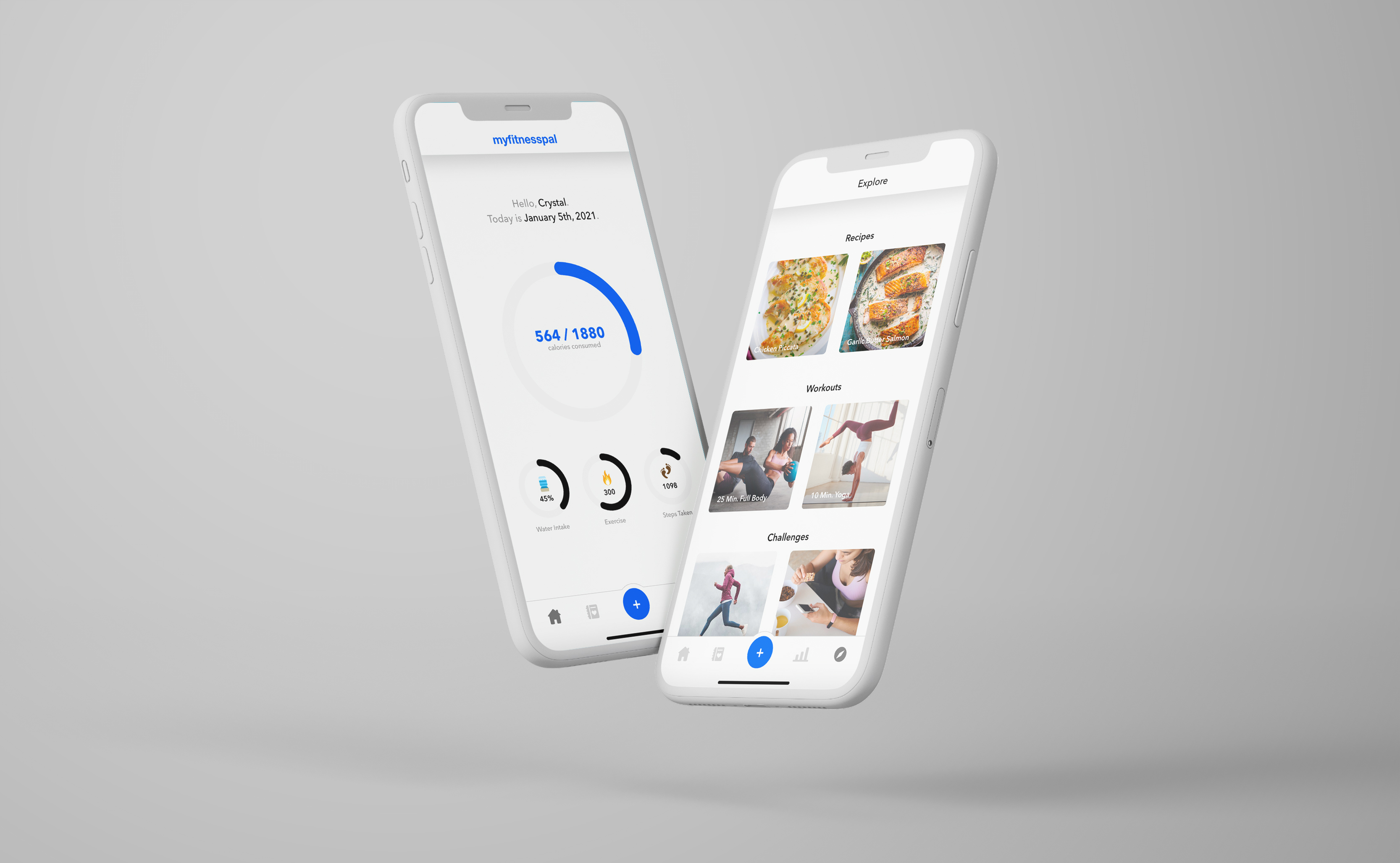
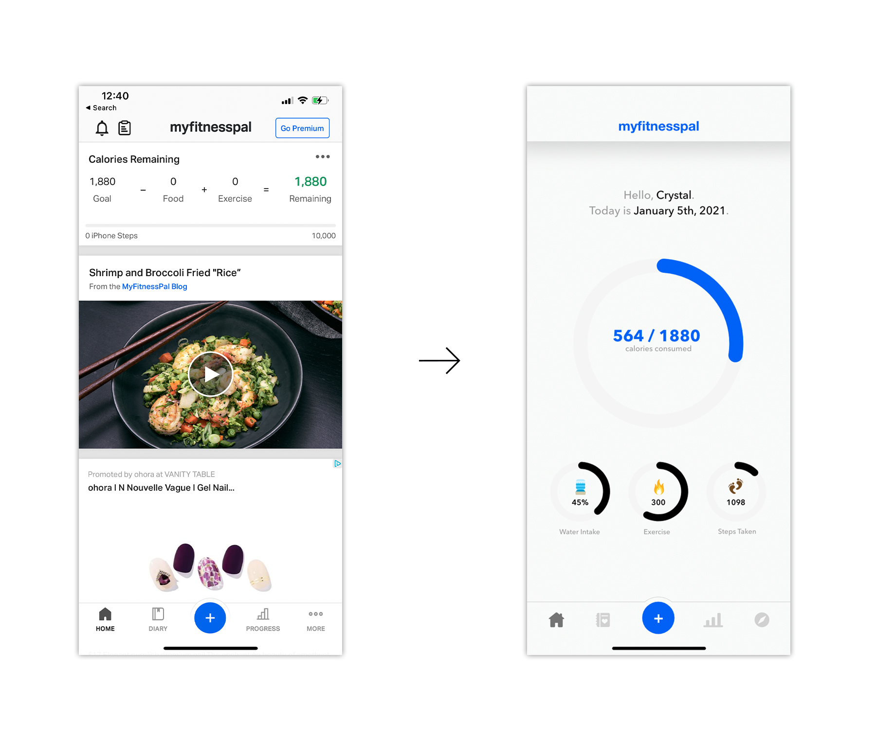
Home
The original home screen appeared to be a secondary screen, rather than a "home" screen that users can default on. I designed it to be more attractive to users and provided visuals so that it would have a more interactive experience. Rather than a pure white screen, I chose a lighter grey so it would not be as harsh on the eyes. I chose to keep the blue plus button in the middle as I liked the quick log features it provided.
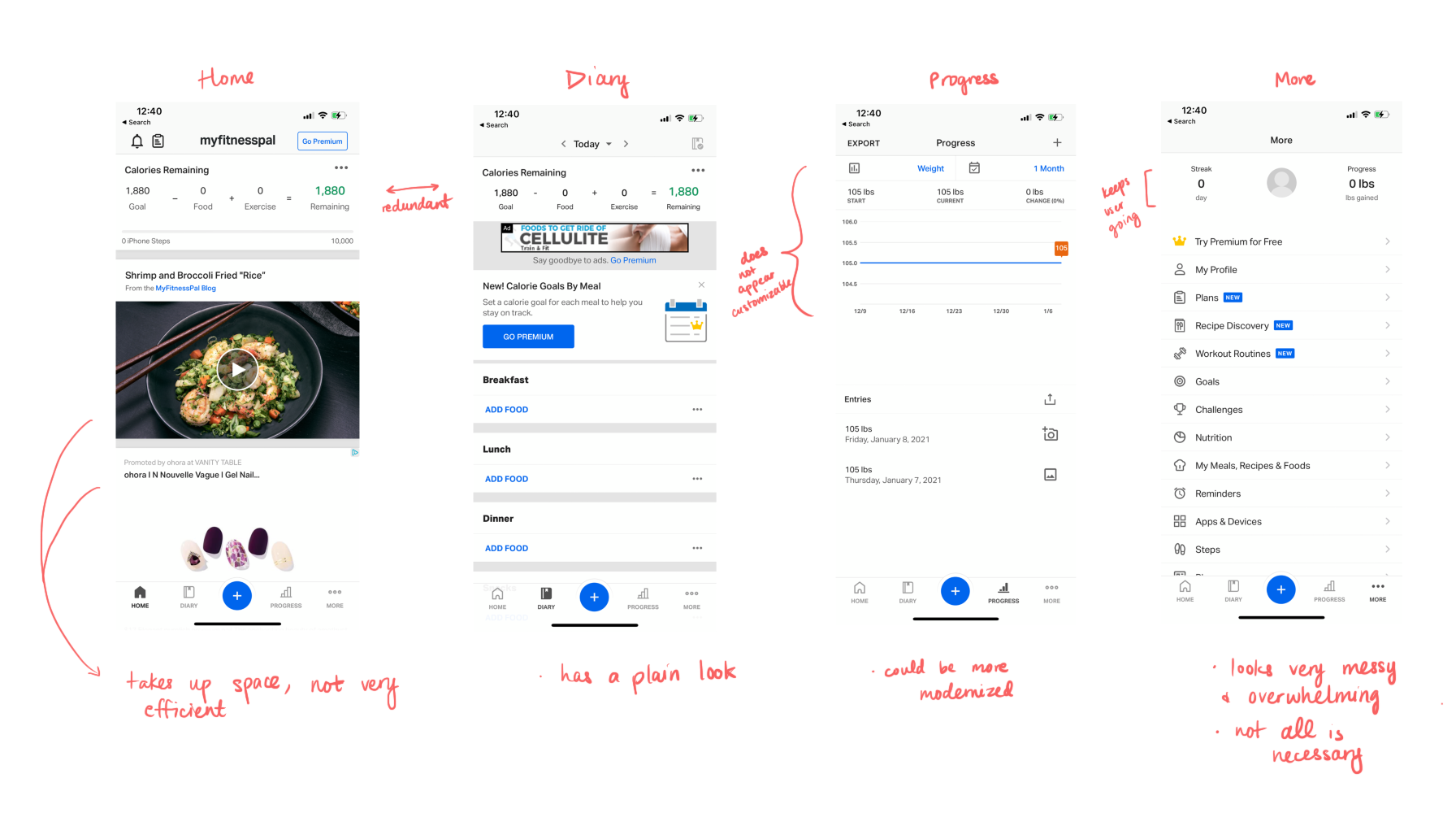
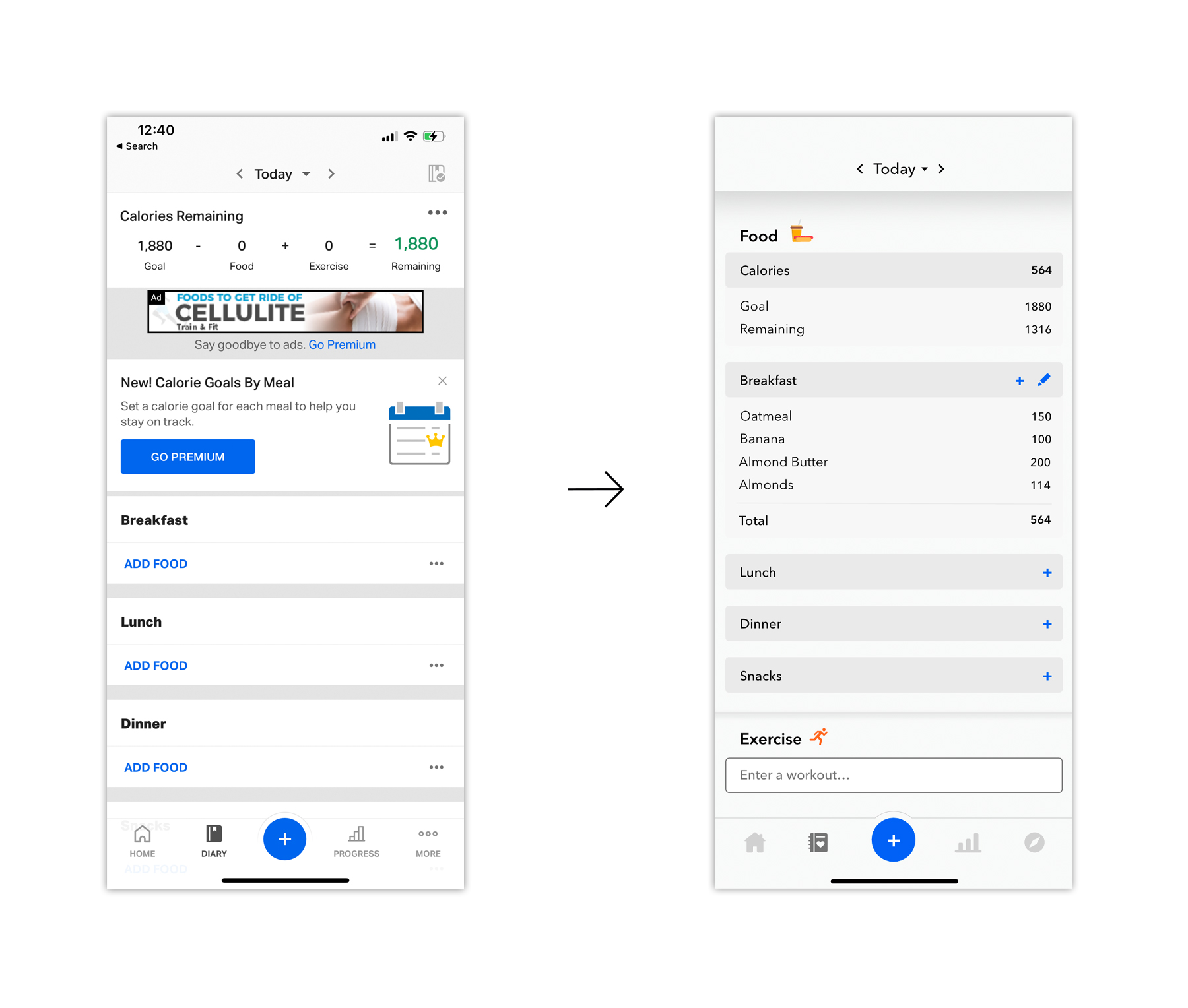
Diary
I went with rounded boxes so the appearance would not seem so harsh. I made the logs look more neat and organized, adding a feature where users can enter in their workouts, as seen at the bottom.
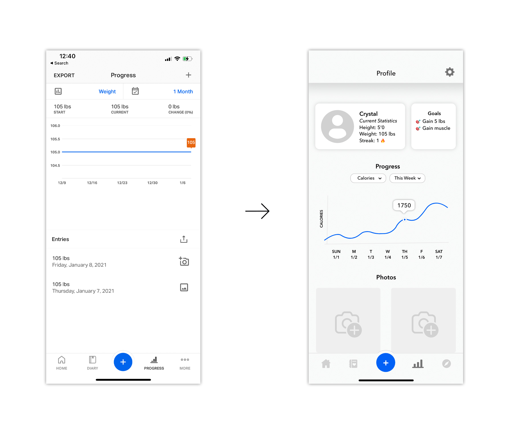
Progress
The original screen had a plain look, not very enticing to users. I decided to integrate the user's profile onto this page, as it would be more tailored towards them and their progress. I added a "Goals" feature, so users could have something to work towards and stay motivated, as well as keep a streak. In the first screen, it was not obvious that users could change the type of progress to view, so in my redesign, I made the call to action buttons stand out more. I also made photos easy to view, as I personally like being able to access my progress photos easily as they have the potential to get lost over time. It also has a more "social media like" appearance and sense of familiarity.
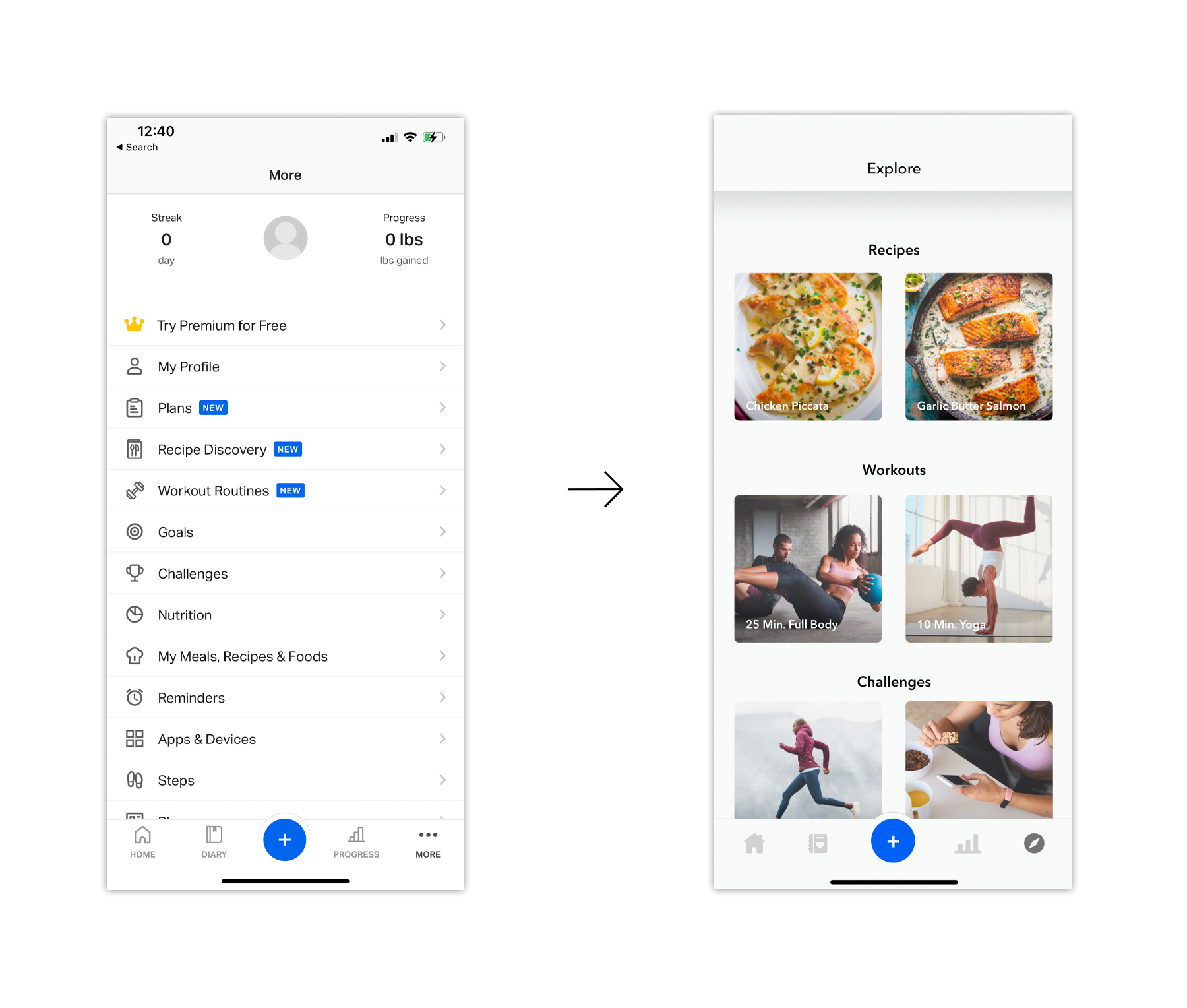
More -> Explore
At first glance, the "more" page had too much going on and appeared overwhelming. It also had a lot of features that seemed unnecessary or could be moved elsewhere. I wanted the goal of the app, logging users' fitness journeys, to be the sole purpose, so I decided to go with a simplified redesign. I made it into an explore page instead, where users could find new recipes, workouts, challenges, etc. Providing pictures is also helpful in engagement. The rest of the options may be found in the previous page, the progress page, in the settings.
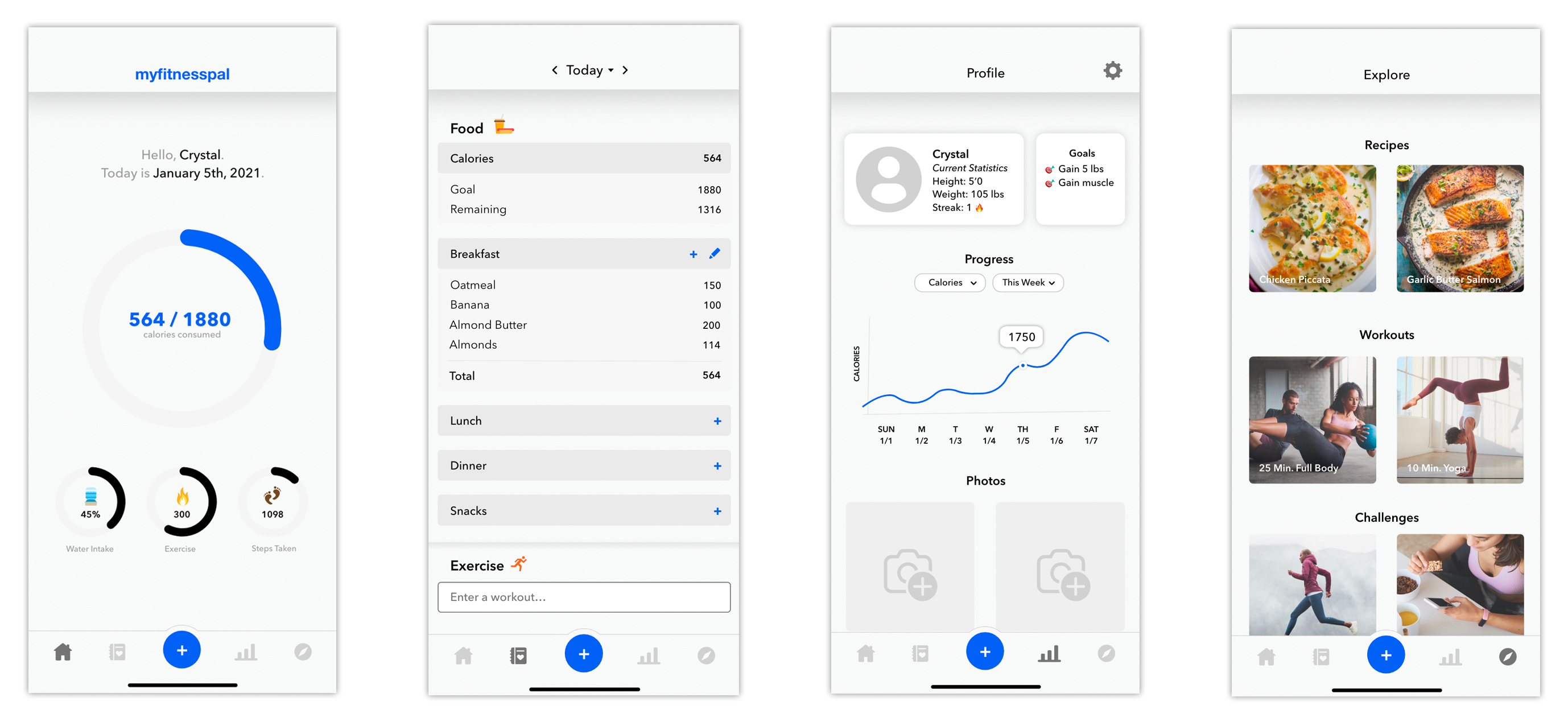
Final Screens //
03. Reflection \
I had always thought about how unmodern the MyFitnessPal app's user interface looked, but having used it for several years, I never thought about redesigning it until now. I do like how it turned out, but I feel that if I collaborated with others when redesigning, the end result would turn out better as I could see their perspectives and their opinions. If I were to do it again, I would maybe branch out from their basic palette and use other colors as well to make some things pop more.